I ordinarily don’t post virals like this, but seeing as though I mentioned that all my contemporaries want a PS3, I guess they (and I!) have to come to grips with what that might mean.
Mildly, mildly NSFW.

I ordinarily don’t post virals like this, but seeing as though I mentioned that all my contemporaries want a PS3, I guess they (and I!) have to come to grips with what that might mean.
Mildly, mildly NSFW.
The BBC listed their sources, gave us the sampling methodology, and drew us some pietastic metrics.
But pie charts and surveys are not very good at illustrating qualitative responses.
Take this one:
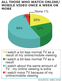
But where is the “I downloaded all the stuff I wanted to see, so I watched less real actual TV” or “Four hours on YouTube left me with one hour of BBC3 before gran told me to go to bed”? Under the label “normal TV”.
The venerable Beeb trudged on with their second tasty pie graphic: